Classification with Sloan Digital Sky Survey (SDSS) Data 
Sean Chapman 

Introduction
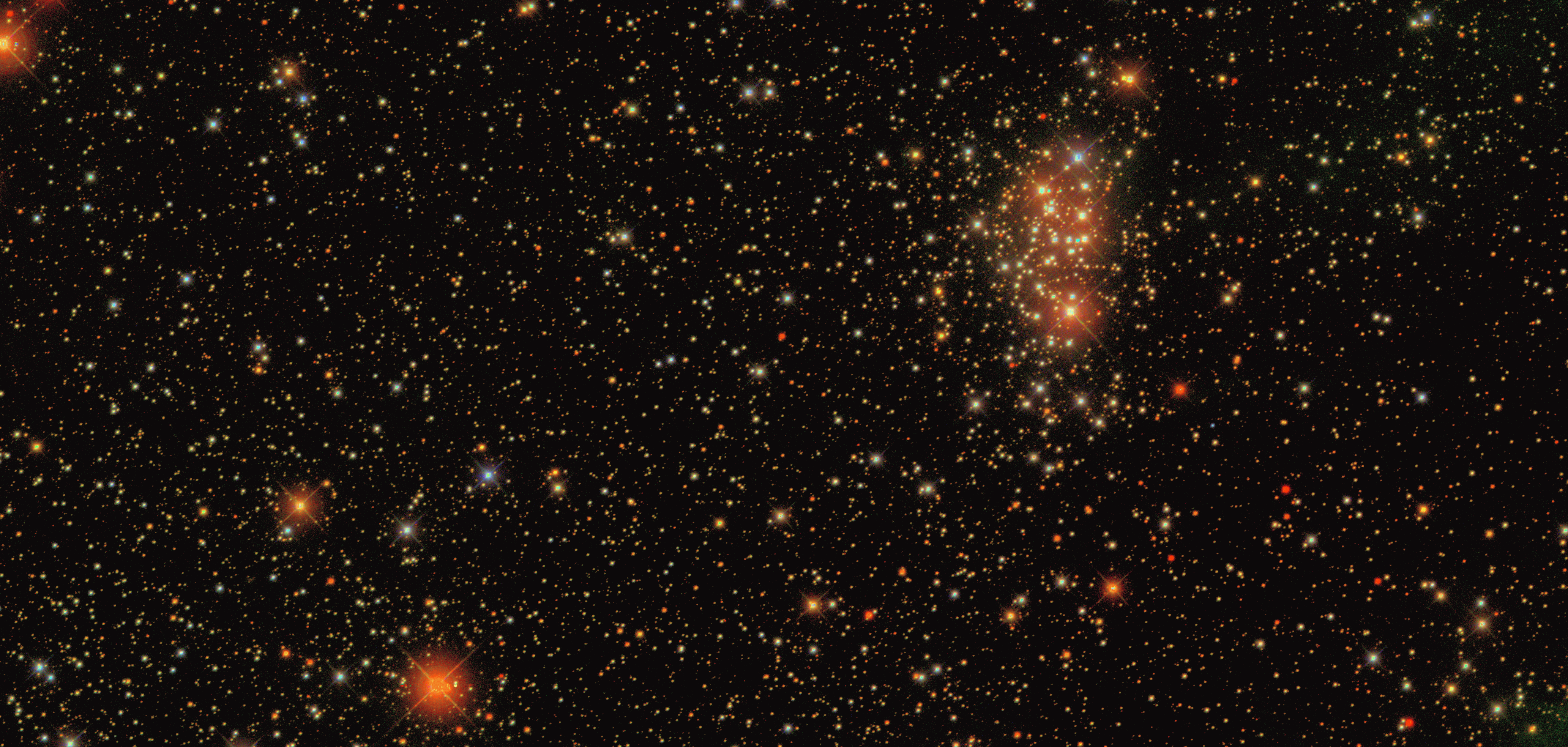
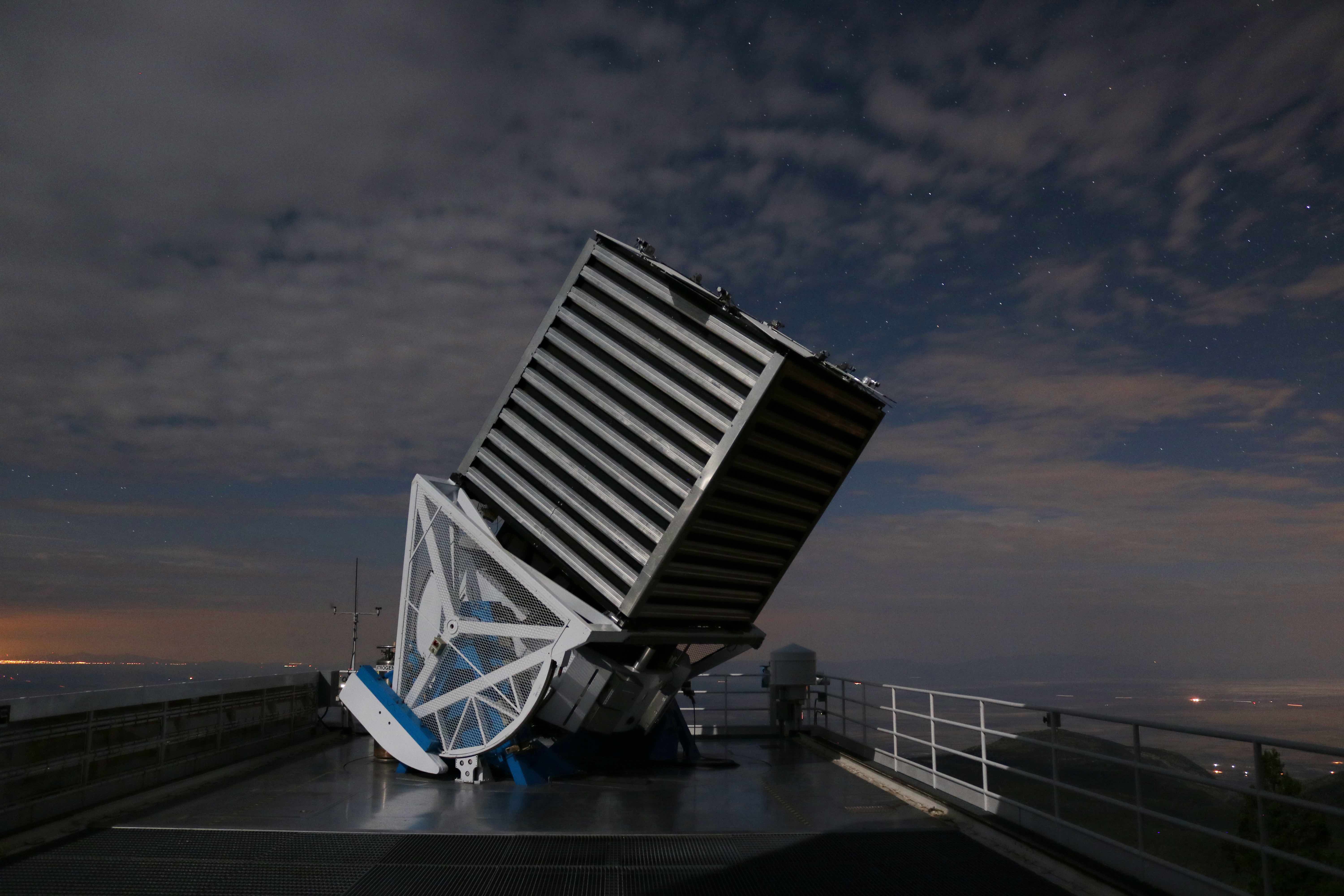
The Sloan Digital Sky Survey (SDSS) is a major multi-spectral imaging and spectroscopic redshift survey of the universe that uses a 2.5 meter wide-angle optical telescope to record photometric information of objects in the night sky. The SDSS has been working to chart the universe in detail for over 20 years, and has collected photometric data on over 1 billion objects. In this notebook, we will learn a little bit about SDSS through an exploration of the data, and we will write some classifiers that will be able to determine whether an object is a STAR, GALAXY, or QUASAR.
The data we will be using for this notebook can be found here. It consists of 10,000 labeled observations from the SDSS Data Release 14.
A detailed breakdown of the SDSS 2.5m telescope which was used to collect this data can be found here.
Getting the Data
First, we'll import all the libraries we need.
import numpy as np
import matplotlib.pyplot as plt
from mpl_toolkits.mplot3d import Axes3D
import seaborn as sns
import graphviz
import pydotplus
import pandas as pd
from sklearn.preprocessing import MinMaxScaler
from sklearn import tree
from sklearn import svm
from sklearn.neighbors import KNeighborsClassifier
from sklearn.naive_bayes import GaussianNB
from sklearn.pipeline import Pipeline
import sklearn.metrics
Now, we'll read the data into a pandas dataframe.
# Import data
sdss_df = pd.read_csv('data/sdss_data.csv')

#Display the first 5 rows
sdss_df
Getting to know the dataset: Feature definitions
The SDSS dataset we are using has 10,000 columns and 18 features. Here's a breakdown of each feature:
- objid: Object identifier - A unique ID to distinguish each object from each other
These are celestial coordinates for the object in question. Click here to learn how this system works.
- ra: J2000 Right ascension (r-band)
- dec: J2000 Declination (r-band)
The telescope's imaging camera is made up of 30 CCD chips, each with a resolution of 2048×2048 pixels, totaling approximately 120 megapixels. The chips are arranged in 5 rows of 6 chips. Each row has a different optical filter with average wavelengths of 355.1, 468.6, 616.5, 748.1 and 893.1 nm, with 95% completeness in typical seeing to magnitudes of 22.0, 22.2, 22.2, 21.3, and 20.5, for u, g, r, i, z respectively. [Shamelessy stolen from Wikipedia]
- u, g, r, i, z: These values represent the response of the 5 bands of the telescope in accordance to the Thuan-Gunn Astronomic Magnitude System
These features represent a field within an image taken by SDSS.
- run: Run number, identifies the specific scan from which this data comes.
- rerun: Rerun number, specifies how the image was processed
- camcol: Camera column, a number between 1 and 6 that identifies the scanline within the run
- field: Field number, typically starts at 11 and can go up to 800 for long runs.
These features contain information pertaining to the type of object that is being observed.
- specobjid: Similar to the objid field, this is just another object identifier
- class: An object's class (galaxy, star, or quasar)
Extra features
- redshift: A measure of the shift in wavelength of the electromagnetic radiation from an object.
- plate: Serial number of the plate used to capture take this observation
- mjd: Modified Julian Date (The date that this observation took place)
- fiberid: Corresponding optical fiber used to direct light from the focal plane to the slithead for this observation

Exploratory Data Analysis
Next we'll perform an exploratory data analysis in order to get a better understanding of the data that we are working with.
We'll start by looking at the correlations between each feature.
fig, ax = plt.subplots(figsize=(14,8))
sns.heatmap(sdss_df.corr(), ax=ax, annot=True)
plt.show()
stars_df = sdss_df.loc[sdss_df['class'] == 'STAR']
galaxies_df = sdss_df.loc[sdss_df['class'] == 'GALAXY']
quasars_df = sdss_df.loc[sdss_df['class'] == 'QSO']


labels= ['STARS', 'GALAXIES', 'QUASARS']
sizes = [len(stars_df)/100, len(galaxies_df)/100, len(quasars_df)/100]
plt.figure(figsize=(7,7))
plt.pie(sizes, labels=labels,autopct='%1.1f%%', colors=['C0', 'turquoise', 'lightgreen'])
plt.show()
The pie chart above tells us what percentage of the data each class represents. As we can see, the most observed objects are galaxies, with stars close behind and quasars last.
Now, let's plot the locations of each observation.
# ax = sns.lmplot(x='ra', y='dec', data=sdss_df, hue='class', fit_reg=False, height=6, aspect=2, palette=sns.color_palette("BuGn_r", 3))
# ax = plt.gca()
# ax.set_title("Celestial Coordinates")
fig = plt.figure(figsize=(8,8))
ax = Axes3D(fig)
x =stars_df['ra']
y =stars_df['dec']
z =stars_df['redshift']
scatter1 = ax.scatter(galaxies_df['ra'], galaxies_df['redshift'], galaxies_df['dec'], c='turquoise')
scatter2 = ax.scatter(quasars_df['ra'], quasars_df['redshift'], quasars_df['dec'], c='lightgreen')
scatter3 = ax.scatter(x, z, y)
ax.set_xlabel('right ascension')
ax.set_ylabel('redshift')
ax.set_zlabel('declination')
ax.set_title("Object locations")
ax.legend((scatter3, scatter1, scatter2), ['STARS', 'GALAXIES', 'QUASARS'])
print()
The above plot tells us about the locations where each observation took place. The right ascension and declination represent celestial coordinates in the night sky. The redshift can be used to help us determine how far away an object is, because the wavelengths of the radiation get stretched more over longer distances. As we can see, stars and galaxies are typically observed to be closer, whereas quasars can be observed much longer distances.
Now we will take a closer look at the redshifts.
fig, axes = plt.subplots(nrows=1, ncols=3,figsize=(16, 6))
ax = sns.violinplot(y="redshift", data=stars_df, ax = axes[0])
ax.set_title("STARS")
ax = sns.violinplot(y="redshift", data=galaxies_df, ax = axes[1], color="turquoise")
ax.set_title("GALAXIES")
ax = sns.violinplot(y="redshift", data=quasars_df, ax = axes[2], color="lightgreen")
ax.set_title("QUASARS")
print()
These violin plots show the distribution of the redshifts for the three classes. The redshift for stars tends to congregate around 0 ± 0.002. The redshift for galaxies tends typically falls around 0.1 + 0.1, and the redshift for quasars falls at around 1.5 ± 1.5.
This tells us two things. First, the farthest objects in the dataset are the quasars, the next closest are galaxies, and the closest objects are stars. Secondly, these plots tell us that the data is very easy to separate, since each class tends to fall within a unique range of redshift. This means that machine learning models should be able to perform very well with this data set.
Classification with Decision Trees
Now we'll use sklearn to train some classifiers on this data. To start, we will use a depth-three decision tree.
Since we know there are some features that won't be helpful for classification, we can remove them from the dataframe.
# Drop useless columns
sdss_df = sdss_df.drop(columns=['objid', 'specobjid', 'run', 'rerun', 'camcol', 'field', 'plate', 'mjd', 'fiberid'])
Now we will prepare our test and training data. This can also be done with a one-liner using train_test_split().
# Separate labels from features
sdss_labels = sdss_df['class']
sdss_features = sdss_df.drop(['class'], axis=1)

#Initialize training data
X_train = sdss_features.values[:8000]
Y_train = sdss_labels.values[:8000]

#Initialize test data
X_test = sdss_features.values[8000: 9999]
Y_test = sdss_labels.values[8000: 9999]
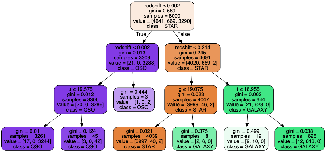
Finally, we train the classifier, visualize the tree, and use the test data to evaluate its accuracy.
# Train a decision tree classifier on the data
dtree_clf = tree.DecisionTreeClassifier(max_depth=3, min_samples_leaf=3)
dtree_clf.fit(X_train, Y_train)
# Visualize the decision tree
dot_data = tree.export_graphviz(dtree_clf, out_file=None,
                      feature_names=sdss_features.columns.values,
                      class_names=['STAR', 'GALAXY', 'QSO'],
                      filled=True, rounded=True,
                      special_characters=True)
pydot_graph = pydotplus.graph_from_dot_data(dot_data)
pydot_graph.set_size('"11,11!"')
pydot_graph.write_png('resized_tree.png')

# Evaluate accuracy of decision tree classifier
predictions = dtree_clf.predict(X_test)
accuracy = (predictions == Y_test).sum() / len(predictions) * 100
print("Accuracy: " + str(accuracy))
As we expected, our classifier performed very well on the test data, with an accuracy of 98.65%. Next, we'll try out some different classifiers and see what results we can get.

Classification with SVMs
Now let's use a support vector machine to classify the data.
svm_clf = svm.SVC()
svm_clf.fit(X_train, Y_train)

predictions = svm_clf.predict(X_test)
accuracy = (predictions == Y_test).sum() / len(predictions) * 100
print("Accuracy: " + str(accuracy))
Our SVM classifier is only predicting 46.5% of the test data correctly. Since SVMs are a linear model, this tells us that we can't classify our data well with only a straight line. In order to fix this problem, we can use a popular trick called the Kernel Method. By using a kernel, we can implicitly map our features to a higher dimension, without having to compute an explicit representation of the higher dimensional data. Let's make a new SVM that instead uses a linear kernel to help make the data easier to separate with a line.
svm_clf = svm.SVC(kernel='linear')
svm_clf.fit(X_train, Y_train)

predictions = svm_clf.predict(X_test)
accuracy = (predictions == Y_test).sum() / len(predictions) * 100
print("Accuracy: " + str(accuracy))
As we can see, the kernelized SVM performs much better.
Classification with K-Nearest-Neighbor
knn_clf = KNeighborsClassifier(n_neighbors=4, weights='distance')
knn_clf.fit(X_train, Y_train)
predictions= knn_clf.predict(X_test)
accuracy = (predictions == Y_test).sum() / len(predictions) * 100
print("Accuracy: " + str(accuracy))
As we can see, our KNN classifier only achieves an accuracy of about 74%.
Classification with Naive-Bayes
Now we'll use a Gaussian Naive-Bayes classifier to take a probabilistic approach to this classification task.
nb_clf = GaussianNB()
nb_clf.fit(X_train, Y_train)
predictions = nb_clf.predict(X_test)
accuracy = (predictions == Y_test).sum() / len(predictions) * 100
print("Accuracy: " + str(accuracy))
Summary
We have learned some interesting facts about the SDSS project, as well as how to analyze data from the SDSS. We also trained several classifiers on the data and evaluated their accuracy. Here are the classifiers we used, in order of best performance to worst:
- Decision Tree: 98.65%
- Gaussian Naive-Bayes: 97.55%
- Kernelized SVM: 96.90%
- K-Nearest-Neighbor: 74.44%
- Unkernelized SVM: 46.47%
The decision tree classifier performed best, with an accuracy of 98.65%. This result is very good, but it may be possible to get better results across all of these classification methods by doing two things: performing a principal component analysis, and normalizing the data. Principal component analysis can help us reduce the number of computations needed to get results. PCA allows us to reduce the dimensionality of our data by replacing a number of columns with principal components (vectors that represent the highest variance in the data). For instance, we could replace the columns u,g,r,i, and v with just two vectors, PCA1 and PCA2 while still maintaining the variance in the data. Normalizing the data can give us better conditioning for the classification problem at hand.
